Popover
A floating card anchored to a trigger, holding a title, a body and anything interactive. A Tooltip is the version with neither.
Anotomy
Structure of the popover and how its internal parts are composed. These are the popover's semantic parts, so they are also what the
classNames and styles objects accept. The trigger is your own element and is not one of them.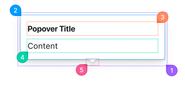
| Name | Description | |
|---|---|---|
1 | root | The positioned layer around the bubble and its arrow. It is portalled to <body> unless getPopupContainer says otherwise, so it is not inside the trigger. |
2 | container | The bubble itself: background, padding, radius and shadow. |
3 | title | The heading inside the bubble, from title. It renders only when title is set. |
4 | content | The bubble's body, from content. |
5 | arrow | The notch pointing back at the trigger. placement moves it, and arrow={false} removes it. |
© 2026 AntUIKit . All rights reserved.