Tag
A short label for a category, a status or a keyword, optionally closable and optionally something the reader can pick.
Anotomy
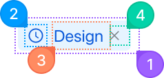
Structure of the tag and how its internal parts are composed. These are the tag's semantic parts, so they are also what the
classNames and styles objects accept.Tag
| Name | Description | |
|---|---|---|
1 | root | The tag itself: background, border, radius, padding and the text color every other part inherits. color and variant set it here. |
2 | icon | The node you pass to icon, before the label. An icon with no children makes a square, icon-only tag. |
3 | content | The label. It only exists as its own part when the tag has an icon. Without one, the text sits straight in the root. |
4 | close | The close button, drawn when closable is set. closeIcon replaces the glyph, and onClose runs on its click. |
Tag.CheckableTagGroup
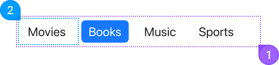
The group takes its own classNames, keyed root and item.
| Name | Description | |
|---|---|---|
1 | root | The row of checkable tags. |
2 | item | One checkable tag, from an entry in options. The selected ones take the filled style, and multiple allows more than one. |
© 2026 AntUIKit . All rights reserved.