Progress
How far along something is: a line, a circle, a dashboard gauge or a set of steps, with a status the color follows.
Anotomy
Structure of the progress bar and how its internal parts are composed. These are its semantic parts, so they are also what the
classNames and styles objects accept. From the top: a line, a line with steps, a circle and a dashboard. On the circle and the dashboard the body is the same box as the root, so it has no pin there.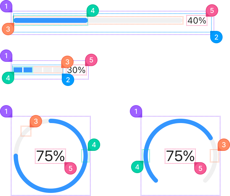
| Name | Description | |
|---|---|---|
1 | root | The whole progress element. type makes it a line, a circle or a dashboard. |
2 | body | The wrapper around the bar and the label. |
3 | rail | The unfilled part behind the track: the gray bar, the empty steps, or the rest of the ring. railColor paints it. |
4 | track | The filled part, as long as percent: the bar, the filled steps, or the arc. strokeColor paints it, and a gradient object works too. |
5 | indicator | The label beside the bar, the percentage by default. format replaces the text, and showInfo={false} removes it. |
© 2026 AntUIKit . All rights reserved.