Colorpicker
A color value chosen from a gradient surface, a set of presets or a typed hex, with alpha and a format switch.
Anotomy
Structure of the color picker and how its internal parts are composed. These are its semantic parts, so they are also what the
classNames and styles objects accept. The panel's part goes in a nested popup object.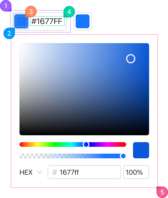
| Name | Description | |
|---|---|---|
1 | root | The trigger that opens the panel. trigger sets whether a click or hover opens it. |
2 | body | The swatch block inside the trigger. |
3 | content | The color itself inside the swatch, from value. A transparent color shows a checkerboard. |
4 | description | The text beside the swatch, the color in format, shown when showText is set. |
5 | popup.root | The panel with the picker, the sliders and the inputs. It renders in a portal, so this key is how you reach it. panelRender rearranges it, and presets adds swatches. |
© 2026 AntUIKit . All rights reserved.