Card
A bounded surface for one thing: a title, a body, an optional cover and a row of actions along the bottom.
Anotomy
Structure of the card and how its internal parts are composed. These are the card's semantic parts, so they are also what the
classNames and styles objects accept. The kit's footer row has no key of its own.Card
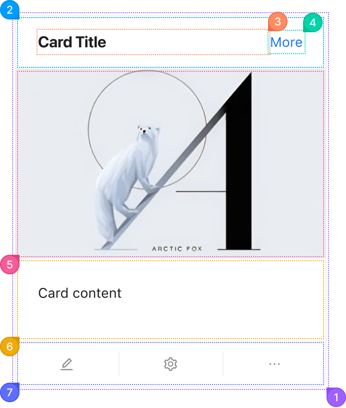
| Name | Description | |
|---|---|---|
1 | root | The card's surface: border, background, radius and shadow. variant and hoverable change it here. |
2 | header | The row above everything else, holding the title and the extra. It renders when title or extra is set. |
3 | title | The heading, from title. It takes the free width and truncates with an ellipsis. |
4 | extra | One control at the end of the header, from extra. Usually a link or a menu button. |
5 | cover | The node from cover, with no padding, so a full-width image meets the card's edges. |
6 | body | The padded content area, holding the card's children. |
7 | actions | The row of equal cells along the bottom, one per item in actions, with a divider between each. |
Card.Meta
Card.Meta takes its own classNames and styles, keyed by these five parts.
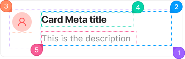
| Name | Description | |
|---|---|---|
1 | root | The row inside the body that lines up the avatar and the text. |
2 | section | The column holding the title and the description. |
3 | avatar | The node from avatar, at the start of the row. Usually an Avatar. |
4 | title | The first line, from title. |
5 | description | The second line, from description. It is the one that wraps. |
© 2026 AntUIKit . All rights reserved.