Anotomy
Structure of the button and how its internal parts are composed. These are the button's semantic parts, so they are also what the
classNames and styles objects accept.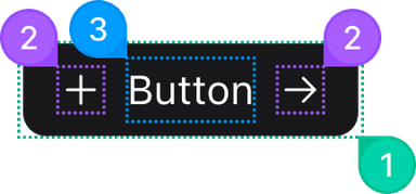
| Name | Description | |
|---|---|---|
1 | root | The <button> itself, or the <a> when href is set: border, background, padding, radius, shadow, transition, cursor, font weight and layout. |
2 | icon | The span around the glyph: icon font size, color inheritance and the SVG reset. AntuikitProvider already sets a class here that evens out the gap to the label, and yours is merged with it rather than replacing it. |
3 | content | The span around the label: no-wrap, centered, with the spacing between two Chinese characters. |
© 2026 AntUIKit . All rights reserved.