Avatar
Represent a person, a team or a thing with an image, initials or an icon, with an indicator on a corner or an edge, a ring and group stacking that hold at every size.
Anotomy
Structure of the avatar and how its internal parts are composed. These are composition parts rather than style hooks: Avatar has no
classNames object keyed by them. Parts 3 and 4 belong to Avatar.Group.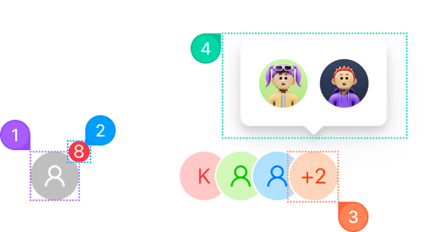
| Name | Description | |
|---|---|---|
1 | root | The avatar itself: one span carrying the shape, the size, the ring and whichever of src, icon or children won. |
2 | indicator | The corner or edge slot: a presence dot, a count, a flag, a camera button. Rendered as a sibling on the shape's own edge, so it adds one wrapper element and only when set. |
3 | max chip | Avatar.Group's overflow count. AntuikitProvider gives it the same fill, border and text color as the avatars. |
4 | max popover | The panel the chip opens, listing the faces the count stands for. Configured through max={{ popover }}. |
© 2026 AntUIKit . All rights reserved.